



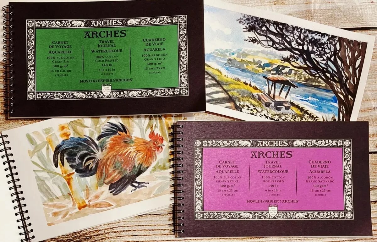
Sandra Strait tested the ARCHES® Aquarelle Travel Journals for you
Sandra Strait is a self-taught American artist and blogger with a passion for creative techniques. Through her website, Doodlewash, she shares product reviews, tests, and tutorials.
We are delighted that she dedicated an article to our ARCHES® Aquarelle Travel Journals. We would like to sincerely thank her for this thorough and inspiring work, and we are pleased to share her article with you here:
25 June 2026
The ARCHES® Aquarelle Travel Journal is essentially a portable pad with professional watercolour paper—available in both cold pressed and hot pressed. Each journal is a 6 × 10 inch, wire bound landscape book built for painting on the go.
If you’ve spent any time with watercolour, you’ve probably seen ARCHES® Aquarelle on store shelves or heard someone say, that’s the watercolour paper—the one professionals use.
Of course, no single paper suits every style or preference, but ARCHES® Aquarelle remains one of the toughest, and most adaptable.
In essence: 100% long fibre cotton + cylinder mould formation + exclusive gelatine sizing all the way through = control, durability, and consistently beautiful colour, and performance.
It’s a true workhorse that still manages to deliver refined, elegant results.
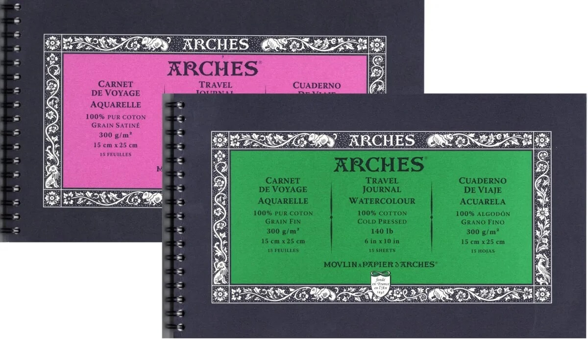
Specs
- Size: 15 x 25 cm/6 x 10 in
- Weight: 300 gsm/140 lb
- Paper: 100% cotton, mould-made
- Surface: Cold Pressed and Hot Pressed
- Colour: Natural White
- No. of sheets: 15
- Binding: Metal spiral binding on the short side (landscape format)
- Cover: Soft card cover & rigid back board
Look & Feel
The ARCHES® Aquarelle Travel Journal comes in cold pressed and hot pressed. The 6 x 10-inch size is large enough for detailed paintings but compact enough for easy carry.
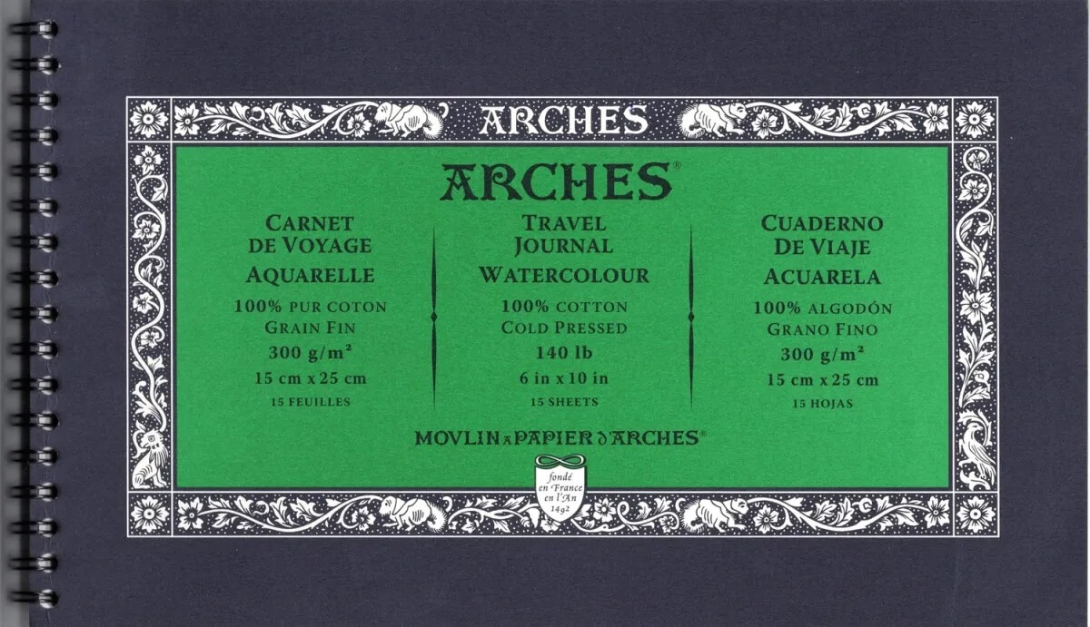
The cold pressed version has a green cover framed in black.
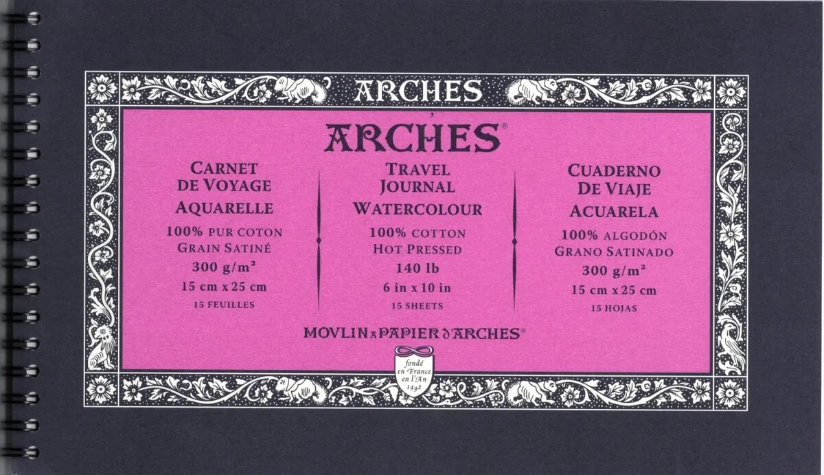
The hot pressed version has a pink (dare I say ‘hot pink’?) cover framed in black.
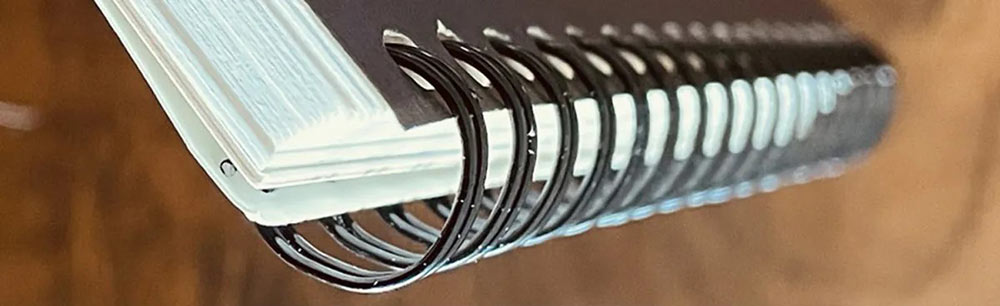
Outside
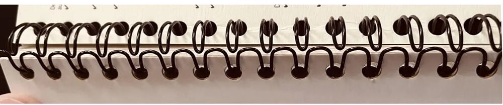
Inside
The journals are bound on the short side, which makes them wonderful for plein air landscapes. The wire binding lets the journal lie completely flat and you can fold the pages all the way back—so it’s easy to handle whether you’re sketching at a desk or painting out in the field.
The wire is thick and sturdy, and the holes in the paper are wide enough to allow easy sliding, but tight enough to keep the paper from hanging at odd angles.
If you flip to the inside back, you can see there is a gap the wire coils meet.
I won’t say it’s easy to do – you need to fiddle with the wires, but it is possible to remove the sheets without tearing the paper. If you have the patience to carefully work the holes back onto the wire, you can return the finished paintings into the journal.
Front and back covers are a flexible paper, and the back also has a rigid board to provide stability. Both are sturdy enough that they could be used for mixed media work if you want to decorate them.
The paper
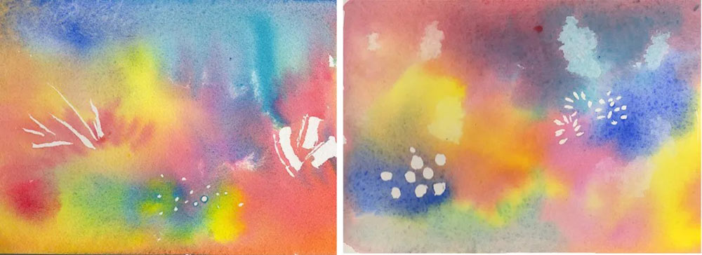
Left : Cold pressed, right : hot pressed
The essentials of ARCHES® paper-making process come down to 100% long fibre cotton, cylinder mould formation, and gelatine sizing all the way to the core—a combination that only ARCHES® uses.
Cold pressed paper is created by pressing the sheet at room temperature.
Their cold pressed is noted for its strong tooth – those valleys and peaks in the paper. It is comparable to paper that would be considered rough in many brands.
While the surface is closer to rough than many cold press papers it still allows good detail, but you won’t get crisp lines with your pen, and you’ll need larger paper sizes if you want small details.
The tooth is harder on brushes, especially real hair or softer brushes.
Their hot pressed paper is created by pressing the sheet through rollers to flatten the fibres for a smoother surface.
It is smoother than the cold pressed, but still rougher than the hot pressed of many brands.
To test the two surfaces, I began by making a few random marks with masking fluid on both a sheet of cold pressed and a sheet of hot pressed. After the masking fluid dried, I saturated each sheet with plenty of water—enough to form small puddles—and then dropped in colour. Tilting the paper helped the pigments flow and blend.
Once everything was fully dry, the masking fluid lifted cleanly from both surfaces.
The behaviour of the washes matched what I typically expect from cold pressed and hot pressed: each surface responded in its characteristic way.
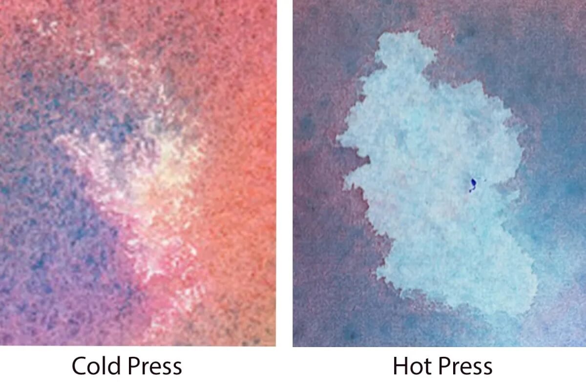
At the same stage of the comparison test, I lifted some colour from both papers, and I think this is where the differences show most clearly.
On the cold pressed, the paint continued to travel for quite a while, so the colours blended more and most edges dried soft and blurry. When I lifted a bit of colour from the damp surface, the pigment kept moving, leaving only a slightly lighter area with a noticeably grainy texture.
On the hot pressed, the paint flowed for only a few seconds before settling in place. This produced harder edges and more distinct marks. Lifting colour from the damp sheet created a clearly defined light spot.
What surprised me most was the amount of granulation that appeared on the hot pressed—it was far more pronounced than I expected.
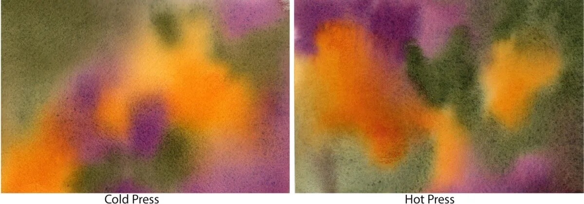
The hot pressed surface is definitely smoother than the cold pressed, so the amount of granulation on both sheets was a surprise. I decided to push the test further and repeated it using pigments known for strong granulation.
Despite the smoother texture, this hot pressed paper granulates beautifully—far more than I expected.
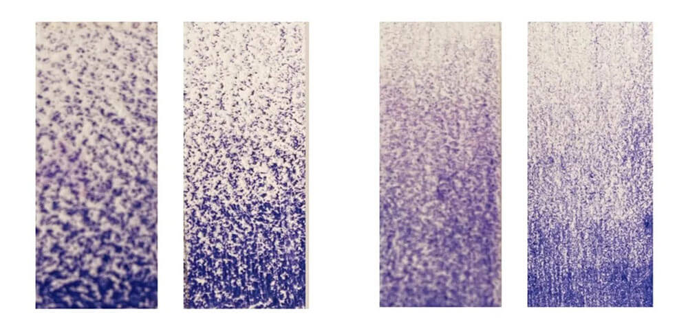
Left : Cold pressed front and back, right : hot pressed front and back
Using a coloured pencil to pick out the texture shows the difference between the two surfaces on both the front and back of the paper. You can see that the distinction isn’t so much in the depth of the peaks and valleys as in their spacing.
On both the cold pressed and hot pressed sheets, the back side is noticeably smoother than the front.
I decided on one more test to highlight the contrast between the two textures. Watercolour paper isn’t really recommended for pen and ink work, but it’s perfect for revealing exactly how the surface behaves.
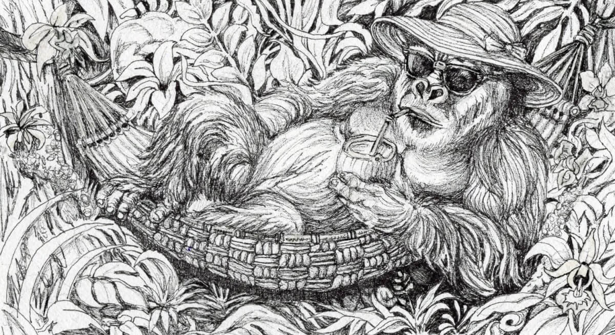
With the cold pressed paper, the pen naturally produces a broken line. It’s difficult to build truly dark areas—you have to keep working the surface until you’ve essentially flattened the texture. On the other hand, with very light pressure you can get that barely there coverage, just skimming the tops of the paper’s tooth.
Even I don’t usually push an ink drawing this detailed on cold pressed. It’s hard on the pen, but I love the character it gives the marks.
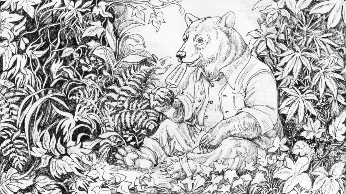
Again, I was surprised. With all that granulation, I expected the hot pressed paper to be almost as hard on the pen as the cold pressed. Instead, it was noticeably easier to build darker areas and achieve crisper lines. I couldn’t quite get the same barely there coverage, but it came close.
I wouldn’t hesitate to use this hot pressed paper for pen and ink in the future—though I’d probably work on the back side.
Plein air
How do these journals actually work for plein air painting—that fancy term for painting on site?
A sunny spring day gave me the perfect excuse to find out. I brought them along on a leisurely drive down WA 14, soaking in those sweeping Columbia Gorge views while putting the paper through its paces.
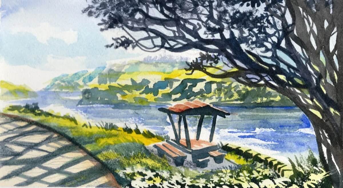
We always pause at Chamberlain Park in Lyle, Washington, so I pulled out the cold pressed journal and painted this view on the spot. I used one of those inexpensive plastic water brushes with the refillable barrel and a tiny clip on palette—simple tools, but perfect for quick studies.
The journal folds back cleanly and is both small and light, which meant I could stand at the overlook above the Columbia River and paint comfortably while taking in the scene.
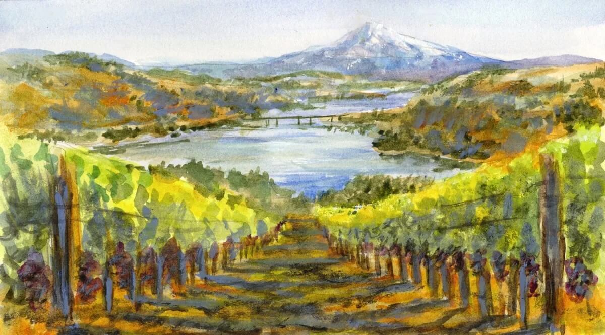
Farther up the road in Maryhill, Washington, the hills open into a string of lovely wineries overlooking the river, with clear views of Mt. Hood. I painted this scene quickly on the hot pressed paper, using the same simple tools as before.
What I love is the balance: the journals are large enough for a satisfying landscape, yet small and light enough to hold comfortably without straining my hand or wrist. For me, they’re just right.
The backside of the paper
Of course I had to paint on the backs of the pages, too. I did these at home, since I wanted to use masking fluid and make sure it behaved just as well on the reverse side as it did on the front.
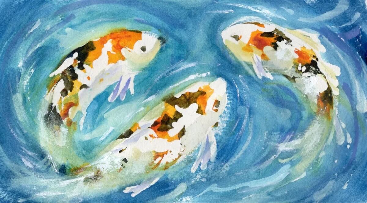
These koi were painted on the cold pressed backside. It’s smoother than the front, yet still comparable to the cold pressed front on many other brands. If you’re used to those papers, this surface may feel closer to what you’re familiar with.
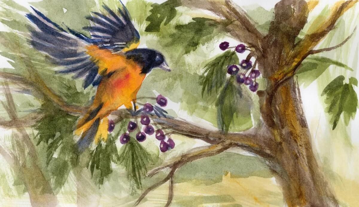
Done on the backside of the hot pressed, this texture was perfect for quick, loose strokes. It catches the character of the brush beautifully, adding a touch of drama even to the simplest marks.
Glazing and Lifting
I’d done some glazing and lifting in the paintings above, but I hadn’t really pushed the paper yet—the toughness ARCHES® is famous for. So I sat down and did some deliberate overworking to see how far it would go.
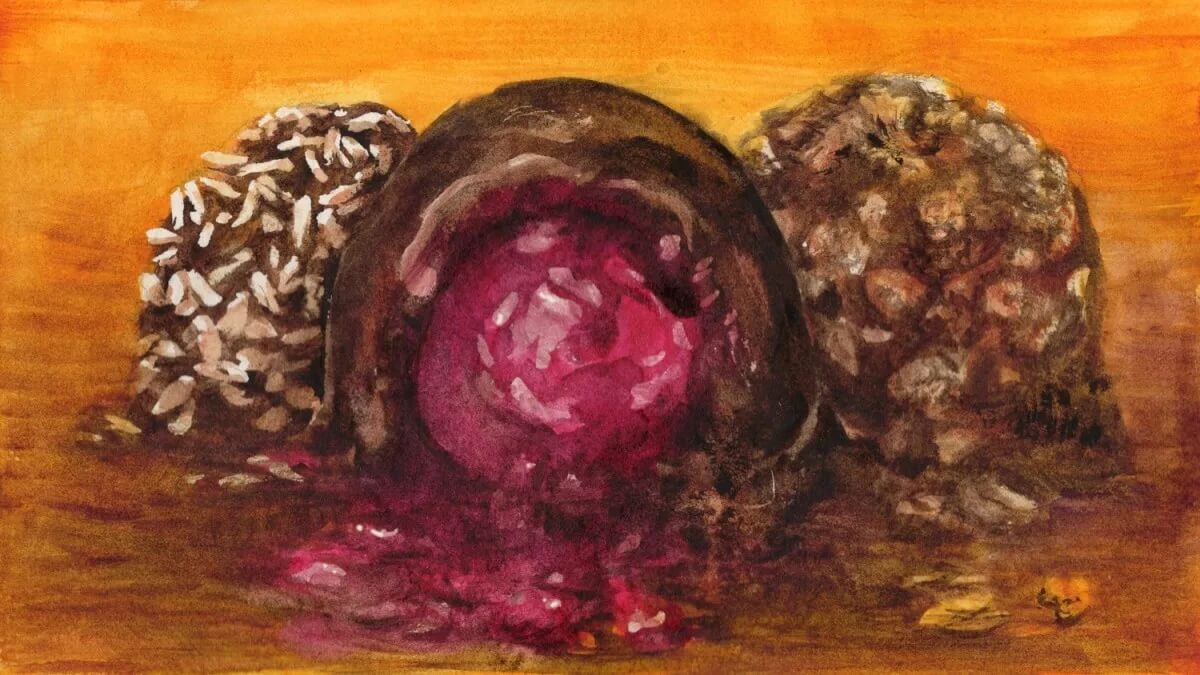
I lost track of how many layers I built up in this cold pressed painting. I lifted colour repeatedly for the highlights on the cherry and the nuts (the coconut was masked), and I treated the chocolate the same way—with the same clean results.
Not once did the paper show even a hint of pilling, and no matter how often I lifted and repainted the same spot, it continued to take colour beautifully. This is a surface you can work hard without the paint turning muddy.
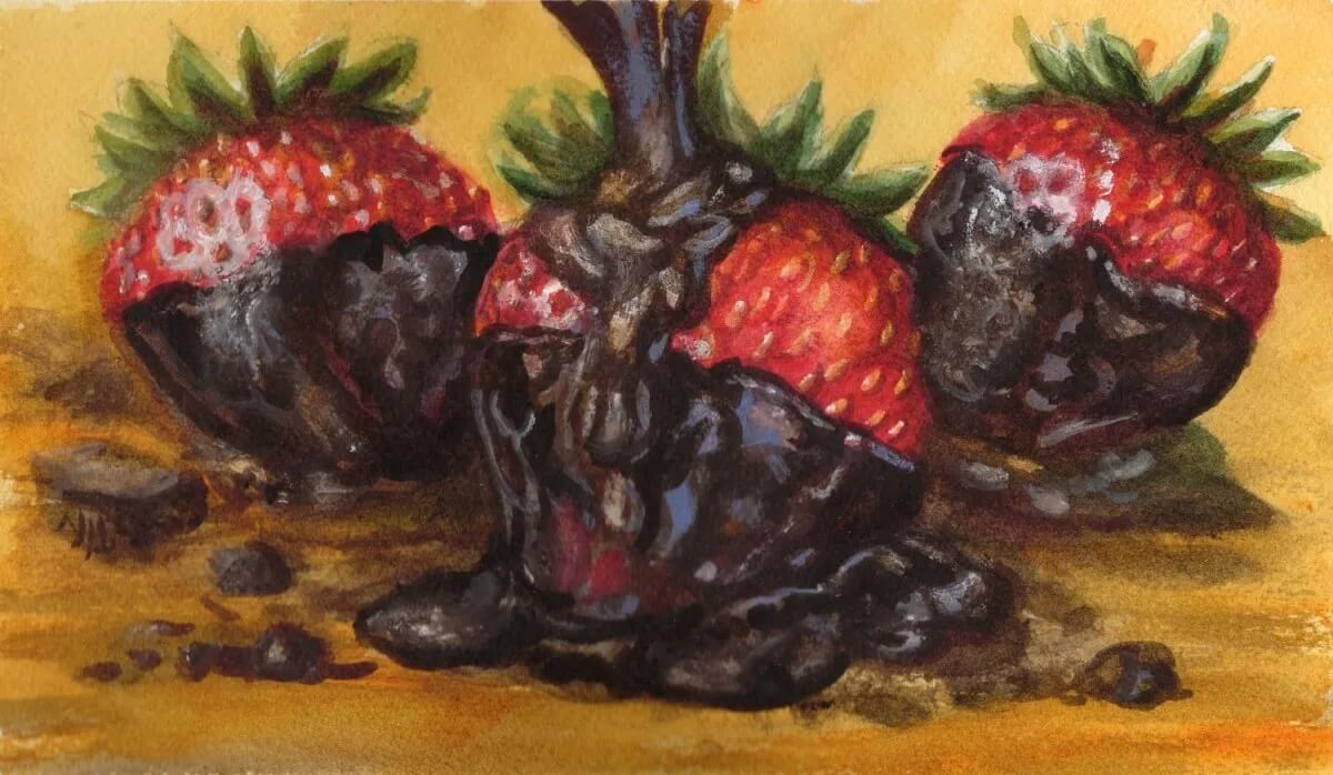
Staying with my chocolate theme, I covered a few strawberries on the hot pressed building up layers, and lifting again to get those crisp highlights. I lifted areas of the chocolate as well, and still ended up with bright, luscious colour.
At the beginning of this review, I mentioned that ARCHES® Aquarelle is known for being tough and adaptable. The surface may feel a bit rough for some artists—even the hot press—but there’s a reason it’s so widely regarded as a professional grade watercolour paper.
Overall
The paper in both journals is 100% long-fibre cotton and is made on a cylinder mould, which produces even fibres with great strength and resistance.
Yet another feature is an exclusive sizing that penetrates the entire sheet. This sizing keeps paint on the surface longer, so the colour stays brighter, and lifting colour is easier.
You can scrub and layer and lift colour over and over without producing those little pills of paper, or losing the ability to add more paint.
The paper does curl a bit when great amounts of water are used, but it flattens as it dries.
Source : https://doodlewash.com/arches-aquarelle-travel-journals-review/
To learn more about ARCHES® Aquarelle paper: